
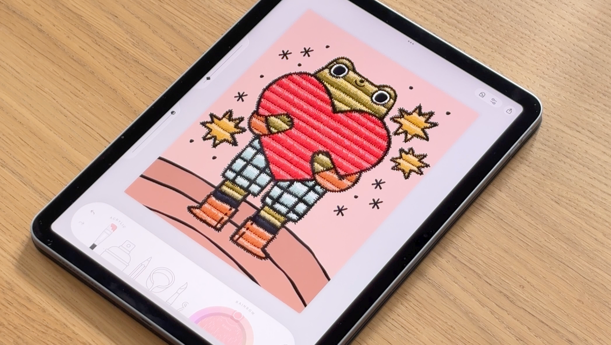
A stitched texture technique that makes your coloring look (and feel) handmade.
You know that cozy feeling when you see embroidered artwork - the way the thread catches the light, sits slightly raised, and looks so satisfyingly tactile?
Good news: you can recreate that feeling digitally. No needle required! 😉
This technique uses simple layered brushstrokes to turn a flat color fill into something that looks genuinely stitched. It's one of those tricks that sounds complicated but is actually very beginner-friendly - and once you try it, you'll want to put it on everything.
Step 1: Start With a Solid Base Color

Before any texture happens, you need a clean, flat fill inside your shape. Think of this as your fabric - the surface the "thread" will sit on top of.
A few things that make this step easier:
- Go for slightly muted, softer tones rather than bright neons. They read more naturally as fabric.
- Keep the fill smooth and even - no gradients just yet.
- Don't overthink it! A simple flat color is exactly what you want here.
This foundation is what makes all the texture stand out beautifully later on.
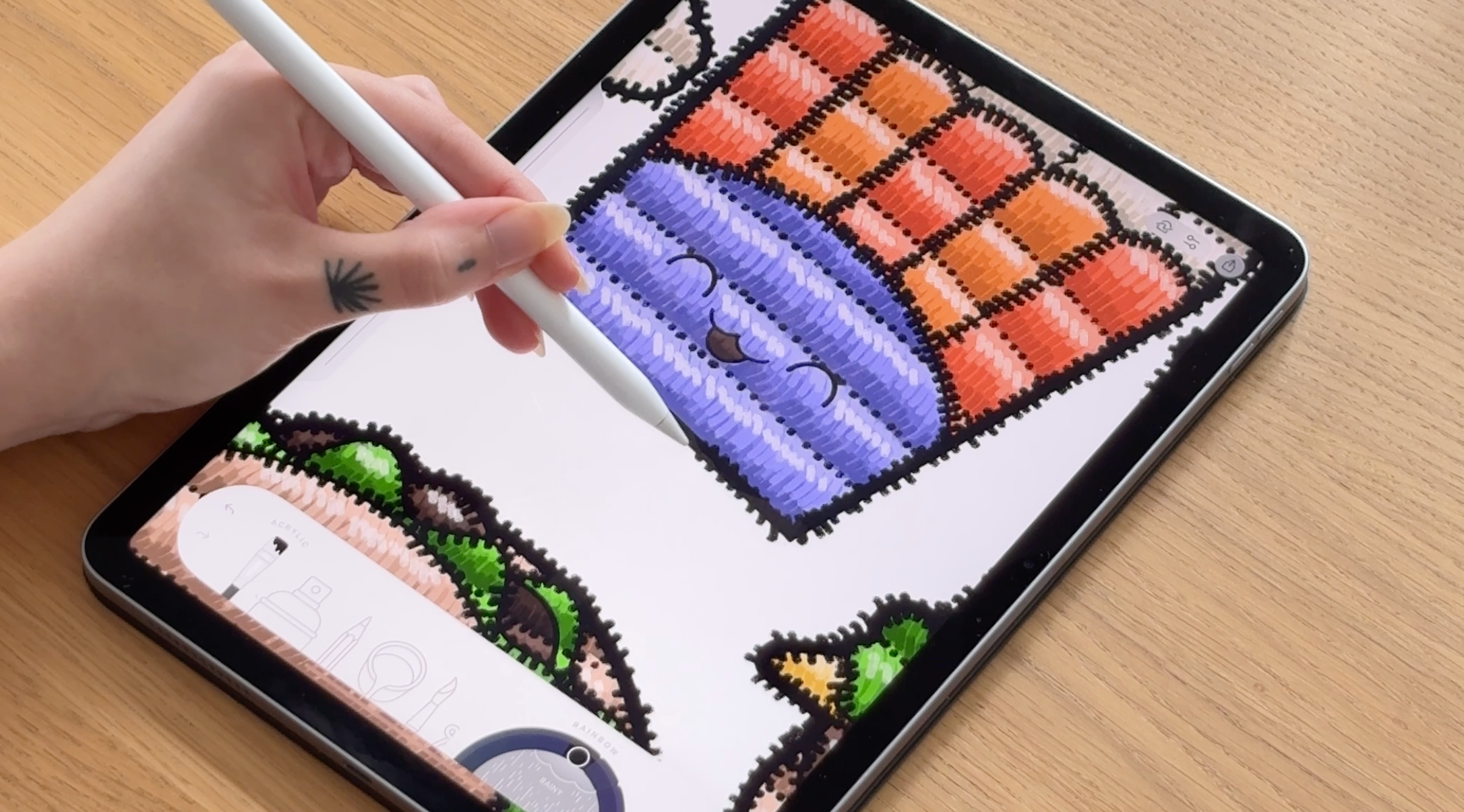
Step 2: Add Your First Stitch Lines

Here's where the magic starts. Using a thin brush, draw short, slightly angled lines across the shape - these are your "stitches."
A few things to keep in mind:
- Keep the lines moving in roughly the same direction. Embroidery has a flow to it.
- Let the lines follow the natural contour of the shape you're coloring.
- Don't stress about making them perfectly even. Real embroidery isn't robotic - and neither should yours be!
If your strokes feel too harsh, try lowering your brush opacity slightly. Softer strokes give a more fabric-like, thread-y feel.
At this stage you're not shading - you're building texture. It's a fun mindset shift!
Step 3: Build Up the Density

One layer of stitches looks nice. Many layers of stitches look convincing.
Go back in and add more strokes between the ones you already drew:
- Gradually fill in the gaps
- Keep the direction consistent
- Avoid crossing your lines randomly - embroidery has discipline!
The repetition is what creates the illusion of thread. The more you layer (while staying consistent), the more handmade and dimensional it starts to look. This is the step where your coloring starts to feel less digital and more like something you could reach out and touch.
Step 4: Add Light and Shadow to the Stitches

Real thread catches the light - and that's what makes embroidery look raised and three-dimensional. You can recreate this with just a little subtle contrast.
Try adding:
- Slightly darker strokes along one edge of the shape (where thread sits in shadow)
- Soft lighter strokes on the opposite side (where light would hit the thread)
The key mindset shift here: you're not shading the shape - you're shading the thread itself. That small change in thinking makes a big difference in how the final result looks.
Step 5: Add the Outer Stitch Border

This is the step that takes it from "interesting texture" to "wait, is that actually embroidered?" 🤩
Using a darker color (black works beautifully), draw short strokes along the outer edge of the shape - like the stitching that holds a patch in place.
Here's what to aim for:
- Short strokes that sit along and slightly overlap the border
- Close together, but not perfectly uniform
- Small irregularities are your friend - they make it feel handmade, not digital
Without this border, the effect reads as textured shading. With it, it reads as real embroidery. It's a small step with a big payoff.
The Finished Look ✨
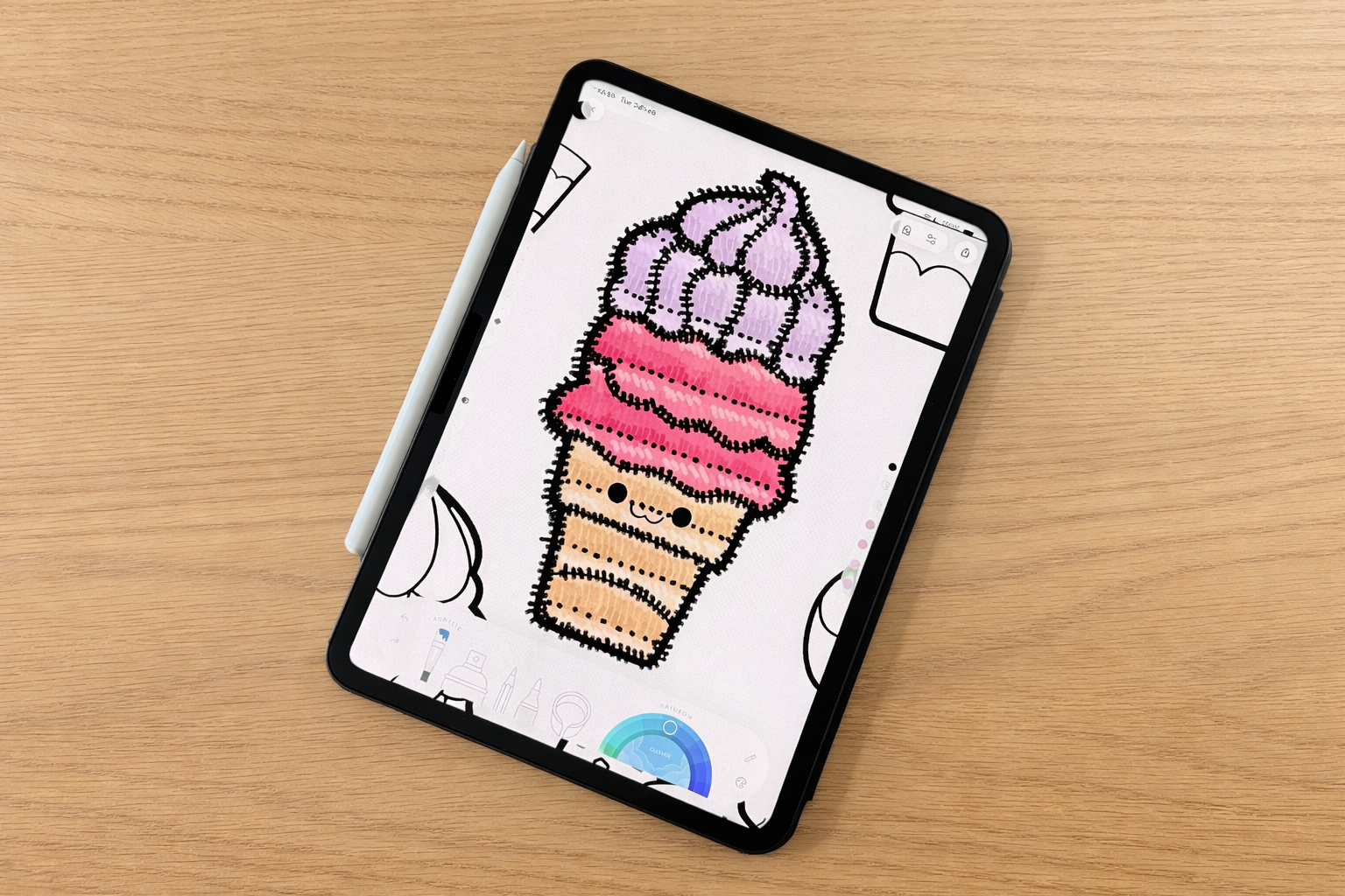
What started as a flat fill is now:
✔ Textured
✔ Raised-looking
✔ Soft and cozy
✔ Almost touchable
And the best part? The whole technique comes down to three things that real thread has too: repetition, direction, and light reflection. When your brain sees consistent short strokes with subtle contrast, it reads "stitched" - not "colored." That's the illusion at work. 🪄
When Should You Use This Technique?

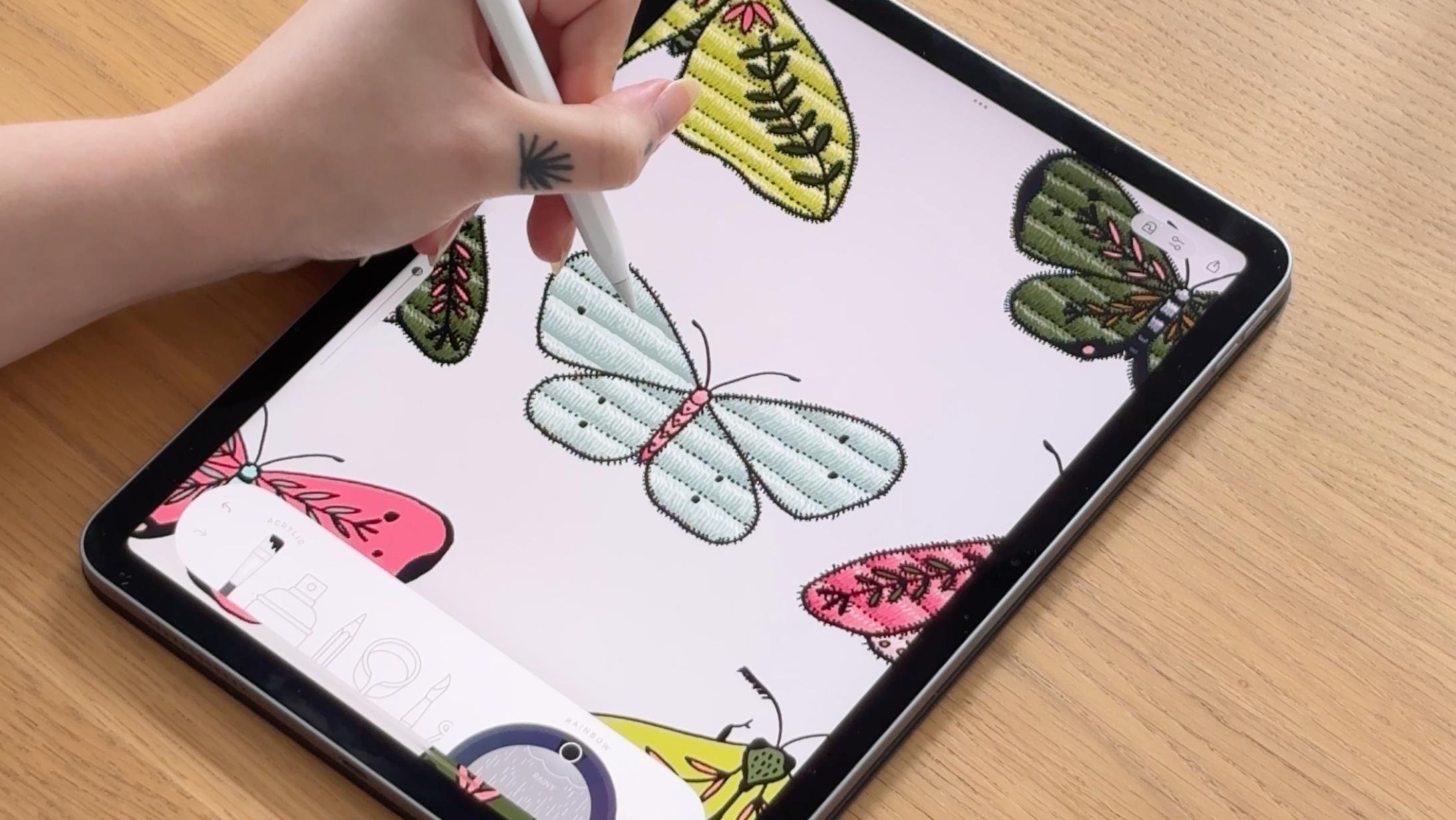
The embroidery effect is especially gorgeous on:
- Floral petals: follow the curve of each petal with your stitches
- Lettering and typography: bold letters filled with embroidery texture look incredible
- Decorative patches or badges: this technique was practically made for this
- Clothing details: jackets, hats, tote bags in illustrations come alive with stitched fills
- Cozy, nostalgic illustrations: anything that deserves that warm, handcrafted feeling
Whenever you want your coloring to feel warm, nostalgic, or like it came off of someone's denim jacket - this is your technique.
Prefer to Watch Instead?
If you'd like to see this technique in action, we've got you covered. Check out the full video tutorial below - sometimes it's so much easier to follow along when you can see every brushstroke happen in real time. 🤗
Give this quick tutorial a try and watch your creativity thrive. Happy coloring! 🎨